

Marqeta Solution Pages: Web Design
Embedded financing is inherently complex and Marqeta's existing solution architecture was fragmented and difficult for prospective customers to navigate. There was a real opportunity for the site to do more in educating visitors and helping them find the right products for their specific business needs.
The project involved designing 7 new child solution pages under the existing Consumer and Commercial overview pages, built to guide customers through Marqeta's capabilities in a clear, exploratory way.
Date
2025 - 2026
Category
Visual Design | Illustration | Branding Web Design | Design System
Digital Marketing
Tools
Figma | Lottielab | Adobe Illustrator
Goal
We set out to make it easier for visitors to map their needs to the right Marqeta solution. That meant educating them on embedded financing use cases, what the products can actually do, and how deeply they solve real problems. Along the way, we wanted to close the gap between discovery and sales so moving from curious to ready to talk felt natural. Since the solutions span both Consumer and Commercial, the page system also had to scale easily across the full range.



Challenge
Translating Complexity
Embedded finance is abstract and technically dense,
and the audience arrives with varying and often limited
familiarity with Marqeta's capabilities.
Technical 👉 Understandable
Production at Scale
7 child solution pages with consistent structure and
bespoke visuals, delivered on a tight timeline. The design system had to scale without feeling templated.
Bespoke 👉 Scalable

Approach: Wireframes
I collaborated cross-functionally with product marketing, content strategy, web development, and the creative team to pressure-test different narrative sequences at the wireframe phase. The stages below give a brief overview of the page outline, visual content strategies, and various interactions explored to reach the final visual design.
Stage 1
The hero section leads into customer social proof, followed by a problem statement backed by data. From there, we walk through the business benefits of the solution and its key components, then bring in a customer testimonial and Marqeta’s unique approach. The page wraps up with relevant customer case studies and a section that routes visitors to other solutions.
Stage 2
We introduced a Progressive Sub Navigation Menu that gives visitors a quick overview and lets them jump to any section without scrolling. Still, the page felt quite technical, closer to a product page than an educational solution page. We added a Use Case section between the business benefits and key components to explain each solution through real life scenarios and applications.
Stage 3
The use case section aided education but lengthened the page, and customers couldn’t see every case at a glance. In stage three, I introduced scroll driven stacking blocks to keep use cases cards visible. Each case study became a CTA within its relevant use case, the problem statement merged with business benefits, platform stats backed Marqeta’s approach, and FAQs boosted our AEO.
Visual Design System
Building a scalable toolkit for the 3 visual buckets
I split the visual toolkit into three buckets: Hero, Use Cases, and How it works. Since these sections repeat across all eight pages, solving each one once meant solving it at scale. Within each bucket, I explored a range of directions and tested whether they could stay consistent without feeling templated.
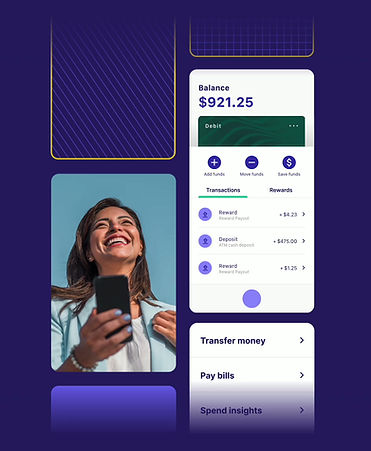
For product illustrations, I used existing product UI components to show how solution elements work together in context. I also carried the solution tag colors from the overview pages into each child page, so the child pages felt native to the site and the journey from overview to solution felt continuous.


Extending the 3D Icon library
I extended Marqeta's 3D icon library to cover new payment concepts these pages introduced.
Each new icon follows the construction logic of the originals, with consistent stroke weight, isometric depth, and a single teal accent, so the additions sit seamlessly alongside the existing set while expanding its vocabulary.

Child Solution Page Design - Impact & A/B Testing
This was the largest web initiative at Marqeta at the time. We turned a diluted, abstract understanding of our solutions into a clear, navigable experience tied directly to product capabilities and customer outcomes.
Conversion rates rose as more visitors reached out to sales. An A/B test also confirmed that leading with business benefits before use cases and product details told the stronger story, shaping future content and design decisions.